Extraction of data from graphs (a.k.a. Data Thievery 101)
When doing a literature synthesis, data you want is often inconveniently only in graph form, and you need a way to get it.
The answer is to use a data extraction tool that lets you define the graph axes and data points, and then converts this data to a table.
I've used them all, and I can tell you that hands-down the best one is PlotDigitizer, or its web app sister WebPlotDigitizer. PlotDigitizer has great automatic point identification algorithms that will save you a ton of time (though you need to check for good point ID and adjust as necessary.) They have extensive tutorials, both print and video, on the site, so I won't rehash how they say to use it. But definitely check it out.
Click here to access the app.
First things first, you'll need images of the graphs. If you are reading the article as a webpage, it should be as easy as right-clicking and saving the image. If you have a PDF of the article where the text is selectable (i.e. it's not just a scanned copy of the print article) then you can use this website to extract all images from a PDF. If you are dealing with a scanned copy of an article, you'll have to zoom in and then take a screenshot on your computer.
Once you have an image, just load it into PlotDigitizer, follow the tutorial, and export your data as .csv to work on it in Excel.
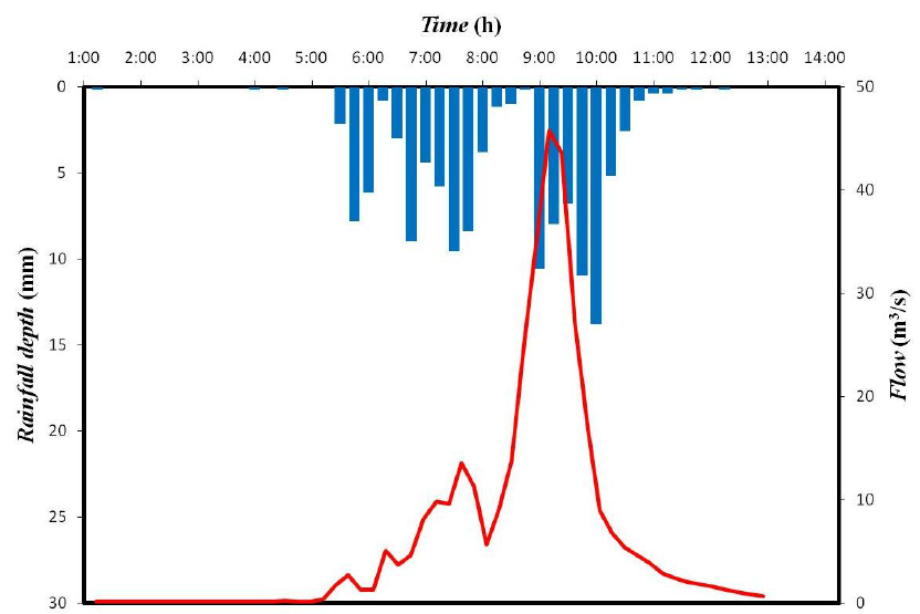
I've done the digitization on the graph below (source). It's a semi-complicated plot with two data types displayed. The original image and my data are linked below, so you can do it and check your data against mine. For the flow data (red line) the automatic algorithm worked perfectly. For the rainfall bar chart, it required a bit more manual editing (moving points, naming each bar with it's timestamp) and playing with the settings for the bar identification algorithm (deltaX=15, deltaValue=2 worked well). Sometimes you may just have to manually enter all your points, though.
The answer is to use a data extraction tool that lets you define the graph axes and data points, and then converts this data to a table.
I've used them all, and I can tell you that hands-down the best one is PlotDigitizer, or its web app sister WebPlotDigitizer. PlotDigitizer has great automatic point identification algorithms that will save you a ton of time (though you need to check for good point ID and adjust as necessary.) They have extensive tutorials, both print and video, on the site, so I won't rehash how they say to use it. But definitely check it out.
Click here to access the app.
First things first, you'll need images of the graphs. If you are reading the article as a webpage, it should be as easy as right-clicking and saving the image. If you have a PDF of the article where the text is selectable (i.e. it's not just a scanned copy of the print article) then you can use this website to extract all images from a PDF. If you are dealing with a scanned copy of an article, you'll have to zoom in and then take a screenshot on your computer.
Once you have an image, just load it into PlotDigitizer, follow the tutorial, and export your data as .csv to work on it in Excel.
I've done the digitization on the graph below (source). It's a semi-complicated plot with two data types displayed. The original image and my data are linked below, so you can do it and check your data against mine. For the flow data (red line) the automatic algorithm worked perfectly. For the rainfall bar chart, it required a bit more manual editing (moving points, naming each bar with it's timestamp) and playing with the settings for the bar identification algorithm (deltaX=15, deltaValue=2 worked well). Sometimes you may just have to manually enter all your points, though.
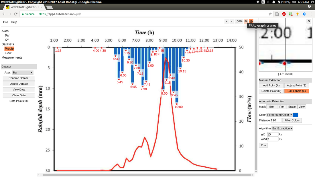
Graph and extracted data:
| 3urk8.png |
| precip.csv |
| flow.csv |
