|
For more information about the data sets used in this animation please visit,http://earthdata.nasa.gov This video is public domain and can be downloaded at: http://svs.gsfc.nasa.gov/goto?11056
|
This false-color map represents the Earth's "carbon metabolism" -- the rate at which plants absorb carbon out of the atmosphere. The map shows the global annual average of the net productivity of vegetation on land and in the ocean during 2001-2002. The yellow and red areas show the highest rates, ranging from 2 to 3 kilograms of carbon taken in per square meter per year. The green, blue, and purple shades show progressively lower productivity. Source: Earth Observatory http://earthobservatory.nasa.gov/News... http://daac.ornl.gov/NPP/npp_home.shtml#
|
Complicated Concepts Explained Well
|
The depth distribution of oxygen...
|
The Coriolis Effect
|
Useful Links
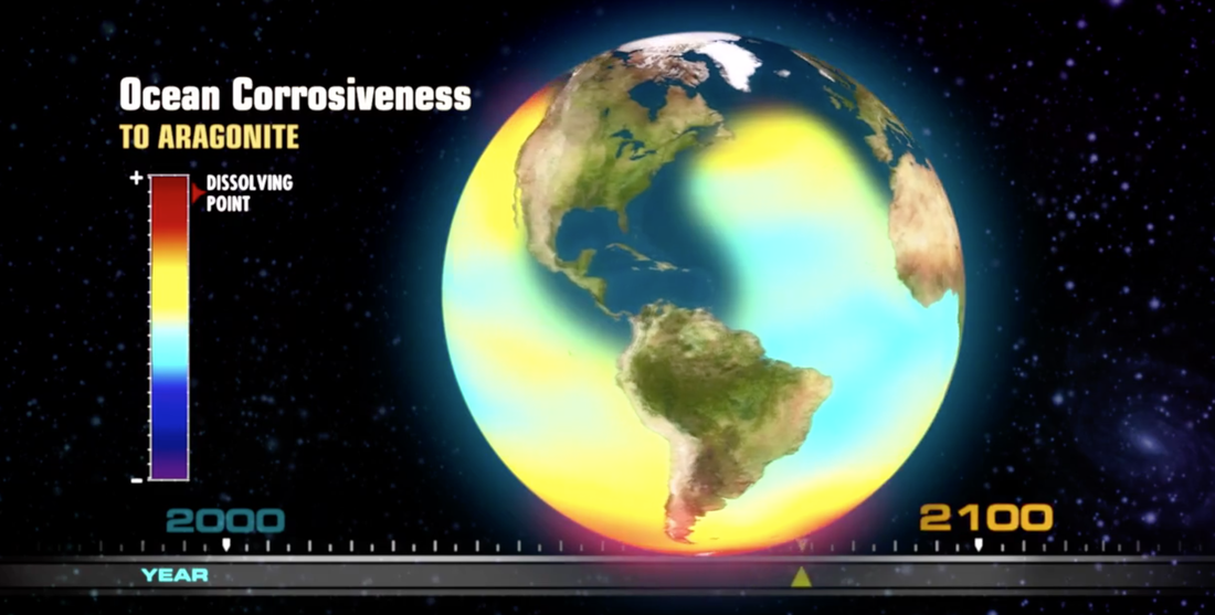
Ocean Acidification (link)
This 21 minute video made by the NRDC explains the issue of ocean acidification. Lots of cameos by top scientists, narrated by Sigourney Weaver, beautiful underwater scenery. Enjoy!
This 21 minute video made by the NRDC explains the issue of ocean acidification. Lots of cameos by top scientists, narrated by Sigourney Weaver, beautiful underwater scenery. Enjoy!
Learn more about ocean currents with this excellent series of simulations and maps from Esri "What causes ocean currents?"
